

CSS or Cascading Style Sheets introduced back in 1996 marked a turning point for making a website, look more like a website.
Nowadays we have weird, cool, fun, classic, and a lot of different styles of websites all thanks to CSS.
But the more you thank CSS the more you regret.
As a front-end developer, I can assure you that if you hate React you probably hate CSS more because of its no programming approach.
And to help you control your nerves before they pop out here are 6 CSS tricks that you would like and are my personal favorite.
1. Flexbox your problems
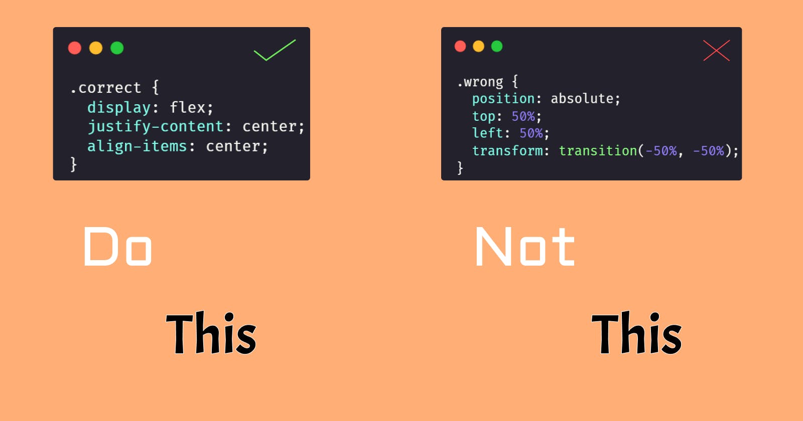
Here's an interview question I created.
"How does one center the div both vertically and horizontally?"
Now before your panic alarm hits off here's the solution.
Ever heard of display: flex? No? Well, may god be with you on this one.
.flexbox {
  display: flex;
  justify-content: center;
  align-items: center;
}
All this does is it gives the element with the class flexbox, an x and y axis and then you can just with the help of justify-centent: center and align-items: center center the element both vertically and horizontally.
Congratulations you are now employable!
2. Grid columns and rows
Ever read a magazine? Or at least a newspaper?
If you did you might have Not wondered how on earth could you make that newspaper layout on a webpage.
Well, you're on a lucky day!
To make your webpage a newspaper page, you must understand how to use grids.
They are simple and easy once you understand how they work, they are just like Flexbox except they are nothing like Flexbox!
Here's some code and try not to panic on laying eyes on it.
.grid {
  display: grid;
  grid-template-columns: 1fr 1fr 1fr;
  gap: 1rem;
}
and the HTML junk:
<div class="grid">
  <p>CSS Is good</p>
  <p>CSS Is good</p>
  <p>CSS Is good</p>
  <p>CSS Is good</p>
  <p>CSS Is good</p>
  <p>CSS Is good</p>
  <p>CSS Is good</p>
  <p>CSS Is good</p>
  <p>CSS Is good</p>
</div>
And here's the result:

And of course, I'm just flexing on you with some unnecessary crap of CSS styling and acting as if I have a PhD in CSS.
3. Responsive aspect ratio
Now when it comes to responsive design there is no bigger pain than those UI designers who don't know how to code and make the entire design overly simple yet difficult to implement in CSS. For the solution, we devs tend to use the @media thing that I don't even know why we use.
But if you ask me I prefer to define an aspect ratio for my images and it always works!
.aspect {
  aspect-ratio: 1/1;
}
and there you have it you mastered Responsive design in under 10 seconds!
4. Responsive design(actual)
OK yes that previous one only works well with images and videos, but here's a better replacement for the @media thing.
there's this CSS feature called clamp which somehow takes @media under its control.
Take a div like this:

Yes I'm flexing with my linguist skills
But say you want to make sure that this div doesn't get smaller than 100px and doesn't get bigger than 500px. Well, then the clamp can be used full.
.clamp-me {
  width: clamp(100px, 100%, 500px);
}
Here I have taken the middle value to be 100%, which means the width of the div will be the same as the width of the parent element, that is 100% of it. Now if you resize the screen you will see the clamp property trying to fit the div to the parent element's width within 100px - 500px. Go ahead and change the value from 100% to anything and observe.
5. CSS... a programming language?
CSS is not a programming language because we cannot apply logic to our css code... or can we?
Ah no, but we have a little bit of programming stuff in css too. That is luckily variables!
Imagine having a primary color scheme as #E8F6FF can you imagine having to copy-paste this all over your CSS code base? And imagine if that UI team decided to change it to something else!!!!
Here's where we get variables into play... finally something useful!
:root {
  --color-blue: #E8F6FF;
}

.blue-text {
  color: var(--color-blue);
}

.blue-background {
  background-color: var(--color-blue);
}
And a job well done, changes on their way and you don't have to copy-paste your values 2 types but only once!
6. Typography Trick 101
Ever wondered why reading text on a webpage sometimes look's better, feel's better, and embarrassing to you? Well here's the answer.
As per typography, it's said that anything between 45 to 75 chars is good. And since we can do this with the help of our clamp trick too.
Take a div and put some text in it.

And yes reading this thing will be boring because it's over 75 chars per line. So let's add that little clamp with the ch unit rather than px
.typo {
  width: clamp(45ch, 50%, 75ch);
}
And here's your homework, figure out why I set the middle value to 50% and why not 100%.
Hope you all found this post useful and now that you know 6 cool CSS things which you probably didn't even knew exist, go ahead and create something and share it below in the comments.
In case I missed any CSS trick that you would like me to cover mention them right below this post... just below where there's a comment button, just right there... WHAT ARE YOU WAITING FOR?